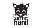
Case Study :: Acme Band

The Setup: Loren Weisman: rockstar, entrepreneur, music producer, author and all around cool client. He wrote a book about how to make it in the music biz without selling your soul to the devil (or a record company) and needed some visuals to back it up. His first venture into the graphics for the book had resulted in a look he was less than thrilled about.
The Goal: Brand a band from the ground up, including logo, website and a whole slew of collateral — contracts, artist statement, bio, one-sheet, rider, stage plot, sound and light schematic...you keeping up with all this?
The Catch: To prove that his system works, Loren made up a band (complete with MySpace page and recorded songs). And it was up to me to make it look like the real deal.
The Big Idea: Loren sent me some of the songs he’d recorded as ‘The Acme Band’ and then turned me loose without much in the way of direction aside from ‘make it look good’. (In case you’re wondering, that is my favorite kind of design gig — makes me feel like a kid in a candy store!) Knowing the target market and listening to the songs, I could see in my mind’s eye what we needed: branding that was bold, highly visible from a distance and cheap to produce for a band on the road. A graphic, eye catching one-color solution.
Survey Says: Loren narrowed his decision to Options 1 & 3 — and with further consideration, he chose....
Option 1: Eye of the Tiger
- Bold, sans serif type offset with irregular brush strokes

- Asymmetrical logotype design balanced by EYEcon
- Hand-crafted, proprietary font is the center of the logotype
- Sheep icon encases and envelops logo
- Sturdy, balanced logotype nestles type into itself and the icon into the type
- Bold, lowercase font echoes the bold, graphic kitty icon
The Big Reveal: After some deliberation, Loren picked Option 3! The balance of bold and whimsical made the Sassy Kitty the winner. We've also prepped a charming little case study that you can download and peruse if you're in the mood, just by clicking here.


