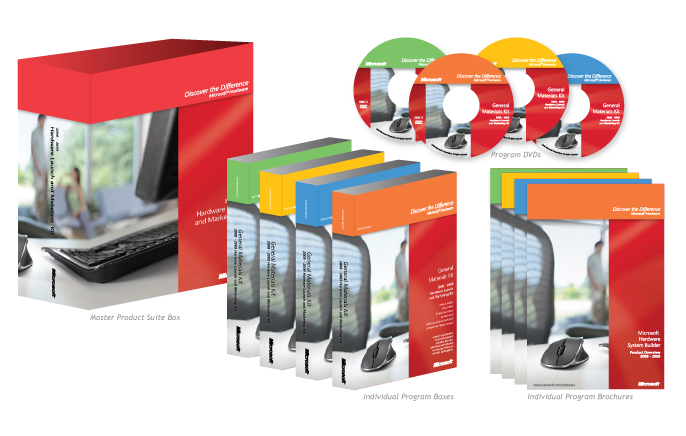
When the Microsoft Hardware Group developed a new program offering, they came to us requesting a sharp new design. It was clear we needed to uphold the Microsoft brand standards — and at the same time create something that didn’t look like everything else. We leveraged the brand colors and logos, searched their image library long and hard to find the perfect shots and designed packaging that was bold, clean and inviting in a businessy way. We love it when a plan comes together!

